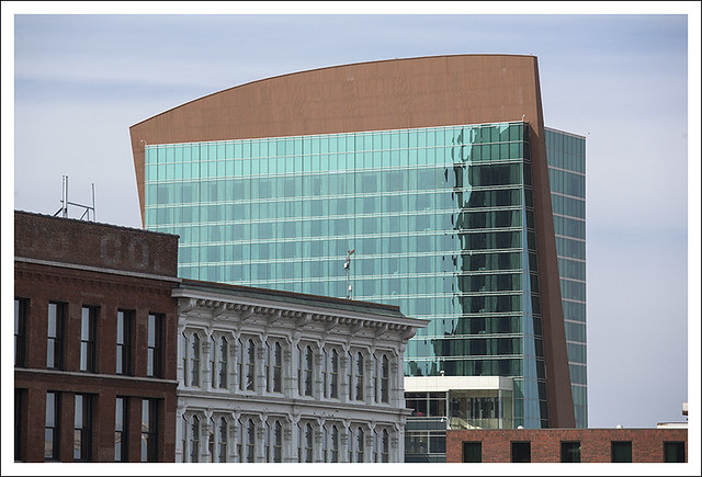
Yesterday's pictures were grim and monochrome. I had only to turn around to see the International-Style-gone-goofy Four Seasons Hotel atop the Lumiere Place Casino. That cock's comb some architect stuck at an angle is, well, a bad idea. (S.C., your view?) It has an LED matrix woven onto the surface, showing very low resolution displays appropriate to the season (like this). But in the foreground we have some century-old buildings in Laclede's Landing, including a cast-iron facade structure, so common in lower Manhattan.
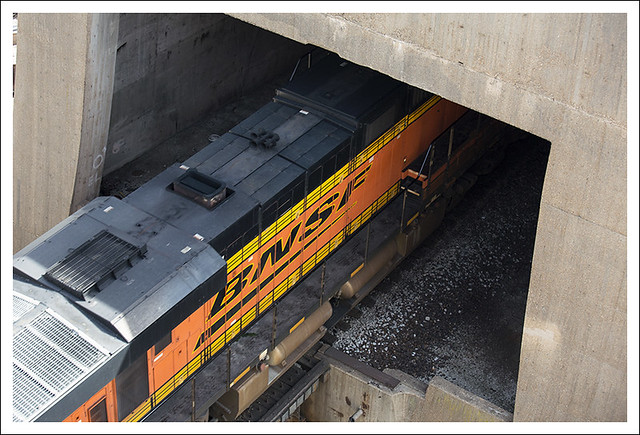
A short way back toward the river, a main railroad track disappears into a tunnel that runs under the Grand Staircase that leads from the Arch to the river. No idea what happens to it during the renovations but, unlike the garage, it has to stay in some form.
Thought I was going to get caught up on comments tonight but my daughter and granddaughter came over.


8 comments:
I sort of like the mix of old and new...
Its clear that after completion of the design dictated by the wish to make the most money with the lest expenses in the shortest of time the building looked like a big serial box. ( Do you need an architect for that no I don't think so?) . That was even the supervisory board to much because they wanted the appearance of a luxury hotel and commissioned the not an architect to make the building more interesting while the first rule should still apply. Yes it really is a job you have to learn for. I don't hope that I now have offended the most famous architect office of St. Louis but thats the way I feel about this building.
I really like it!
Maybe it because, living in a small-big city up here I don't see this much. Gotta get out more, I guess.
It does look rather goofy- but given that it's on top of a casino, that's almost to be expected.
It's certainly the kind of mix that appeals or not Bob.. I just enjoy getting to see from afar :)
I like that old row of houses... :-)
It is a fine photo and a nice mix of architectural styles.
Uhhhhhhhh, no.
Post a Comment