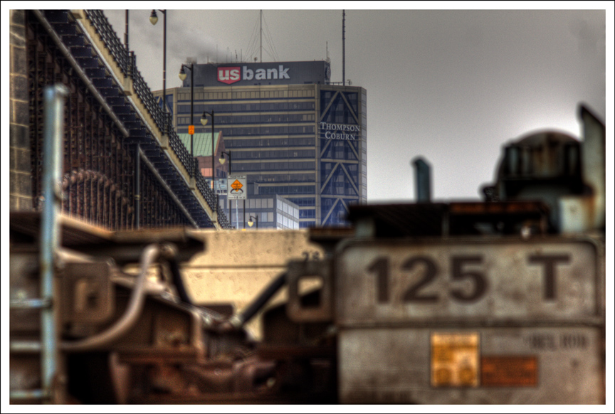
I don't know which of these two pictures I like better so I posted them both.I lean towards the first one. Depends on what you want to emphasize. They were taken moments apart on the East St. Louis riverfront looking back at Eads Bridge and downtown. IMHO, all this architectural signage that's been sprouting up recently promoting big law firms, banks and whatnot stinks.it spoils the architecture. You don't see huge corporate logos on the AT&T Building in New York or the Transamerica Building in San Francisco. They are their own signatures.
Absolutely got to get out and shoot some new local material this weekend.
«Louis» likes the second image as well, for the reasons Virginia gave. In the second image, the train almost looks as if it is a painting, as does the bridge. «Louis» really likes the composition of the second image.


7 comments:
Hi and good morning. You are making me miss StL like crazy. I think I like the second shot best; the textures, the complex geometry. Happy shooting.
deux superbes photos et surtout deux superbes effets, avec une préférence pour la première
Pour moi, the second. IT deemphasizes that ugly bank building! Love that crusty old train.
V
I also love the second photo, but it is interesting how the different focus and depth of field can produce such different results from the same scene.
I prefer the second one. Strange how ugliness becomes art.
«Louis» likes the second image as well, for the reasons Virginia gave. In the second image, the train almost looks as if it is a painting, as does the bridge. «Louis» really likes the composition of the second image.
Tough call as to which one I prefer. love the train details in the second shot, but the first one has that appeal that makes me wonder.
Post a Comment