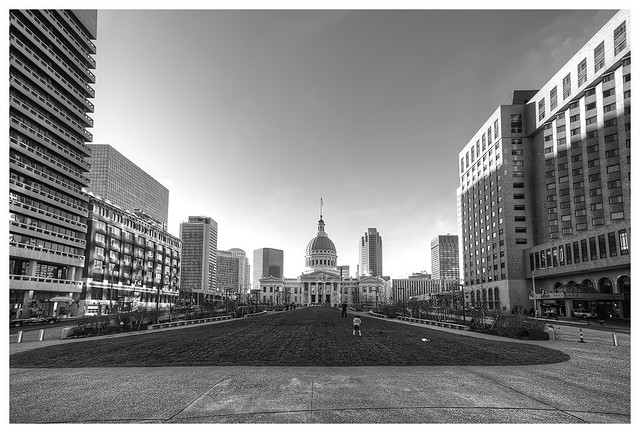
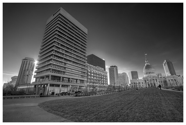
The renovations around the Arch have made quite a mess. One little bit of it is finished and reopened. This is Luther Ely Smith Square, where the city streets end at an expressway in a trench below street level, followed by the Arch itself. The old square was, um, rather plain. The new plan has made it more attractive. A deck was built over the road so pedestrians can walk directly from downtown onto the Arch grounds. That's an improvement.
Mr. Smith was a prominent citizen of St. Louis some decades ago. He was instrumental in creating the civic effort that led to the Arch's construction. I bet you couldn't find one local resident in ten thousand today who could identify him. I had to look him up on Wikipedia.
There will be more of this type of post as the overall plan moves forward. Some time I'll write one of my occasional rants about the awful things the project is doing to downtown traffic patterns.


I love these cityscapes in black and white. Architecture just looks better that way to me.
ReplyDeleteLooks really beautiful. I have seen ads advertising Saint Louis as a destination around DC.
ReplyDeleteVery nicely composed and edited BWs. :)
ReplyDeleteI'm going to have to make a trip to St. Louis to see all these changes.
ReplyDeleteI used to work in the Gateway Tower, many years ago. 18th floor. D'Arcy Masius Benton & Bowles Advertising.
ReplyDeleteSo sharp and perfectly composed! Well done, Bob.
ReplyDeleteBeautifully rendered in black and white!
ReplyDeleteTwo very special images in crisp-and-sharp-as-a-tack black and white. Nicely done, Mr. Crowe. (And take a deep breath and suppress the rants.)
ReplyDeleteThat first photo is superb and needs to be framed.
ReplyDelete